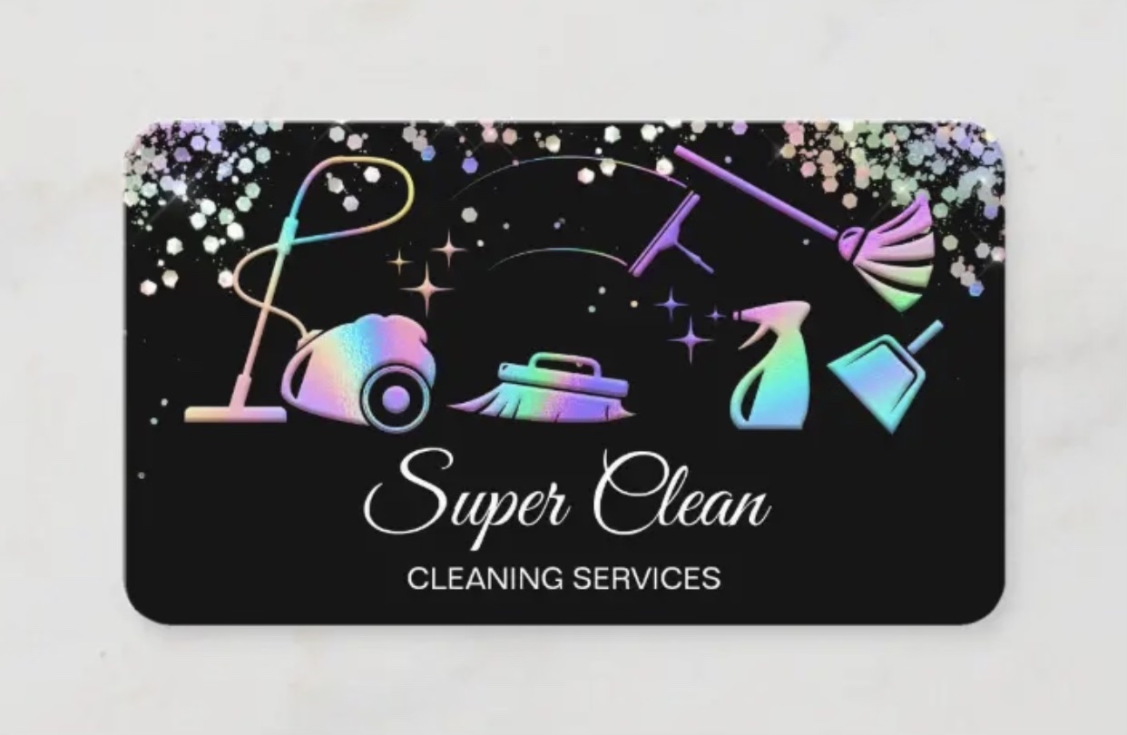
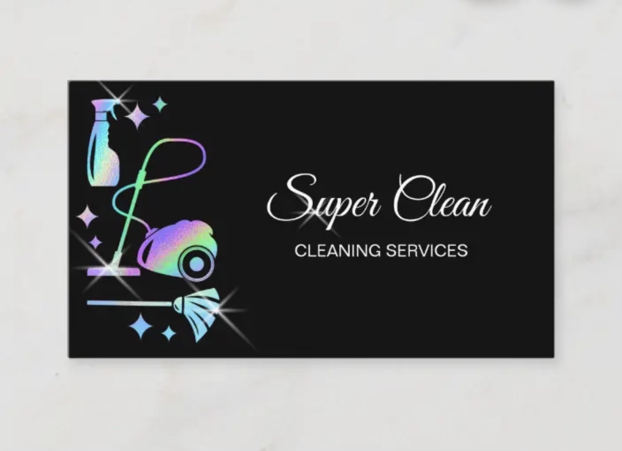
Super Clean has been in business for over five years now here in the Tallahassee area. When she first started out she was looking for something eye-catching to catch people’s attention anywhere she left her business cards. She was now looking for something more subtle and elegant with the rebranding she is looking to begin next month.
Solution: I informed her she could keep the same logo and design she has, but let me tone down the confetti look she has around the top and move her images to the side and bring her logo more so towards the middle and centered. After seeing the final product she was ecstatic and truly appreciated the effort and noticed how much a small change can make a huge difference.